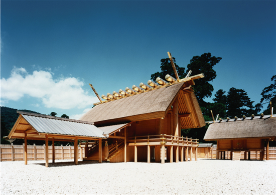
The Ise Shrine is pretty cool. The Emperor of Japan had it built in the 7th Century. It’s made of untreated wood, yet it’s stood for over 1300 years. How?

Because master carpenters rebuild the whole thing – board by board – every 20 years.
Your site won’t have to serve you for quite that long, but you can build it to last. If you structure it according to a few best-practices, it’s more likely to rank well in the local results, and to be easy for customers to use. It will also be easier to make changes later on if you need to.
I’m not talking about internal link structure (how your pages should link together). Other posts deal with that nicely. Nor am I talking about what should be on your pages. I’ve talked about that, too.
I’m talking about where to put stuff. Simply having “content” on your site isn’t enough. You need to organize it in a way that Google and customers can understand all your business offers.
For my clients’ sites, there are some points I really harp on, and some that I don’t consider crucial – but wise to do. Let’s go through the former – my “hard rules” – first.
My hard rules:
1. Have one site – or as few as possible. Avoid microsites. Avoid mirror sites.
2. Put your blog on the same domain. Preferably it’s at yoursite.com/blog. You want your posts and any links to benefit the site you’re trying to rank. (By the way, if you don’t have a blog because your wheels are spinning, see this and this.)
3. Your page structure should be granular: Have a page for each service, each location, each practitioner or employee.
4. Form a “bulls’-eye” pattern with your content. You should have an area of your site – like your blog – where you’re concentrating useful content, but you should also have “content” spread throughout the rest of your site. That stuff can rank. Think FAQ pages, bio pages, or city pages.
5. Your homepage should be a static page, rather than feature your latest blog posts. One reason (of many) is that Google needs a consistent picture of what your business offers, if you’re to rank for those services. The blog post du jour won’t necessarily do that.
My softer rules:
6. Your navigation should be dummy-simple. You want to avoid pogo-sticking. If you want people to see your “Products” page, it should probably be in your top menu.
7. Avoid “island” pages – pages that have no internal links to them, or only links that are buried in pages few people see. This is in the same vein as point #6. Everything should be findable in 1-2 clicks from your homepage. Google needs to be able to crawl those pages easily. And if you don’t want people to find those pages easily, you should reconsider whether they even should be on your site.
8. Use as few subdirectories as possible. (Or else you get this.)
OK, time for a quick break.

Now, you may want to check out some examples of well-structured sites. Here are a few keepers:
CohenWintersPlasticSurgery.com
It’s also worth checking out these relevant posts (including a couple of mine):
Intelligent Site Structure for Better SEO – Joost de Valk
Site Architecture & Search Engine Success Factors – SearchEngineLand
The Anatomy of an Optimal Local Landing Page – Mike Ramsey
Location pages for local businesses and organizations – Google Developers
Microsites for Local SEO: the Pros and Cons – me
21 Pages a “Small Local Business” Site Needs for Tip-Top Local Visibility – me
—
How do you suggest structuring a site for maximum local visibility?
Did I forget any big no-nos?
Leave a comment!