Having a solid “Review Us” page can help you rack up reviews on the local review sites that matter.
When you ask customers / clients / patients to review you, you can send them to a simple URL on your site, where you ask for feedback and give them a choice of review sites.
If it’s a page that’s visible to non-customers on your site, and if it shows off the reviews you’ve already got, it’s a great social-proof element that can win those people over. It can also “condition” those customers to write you a review, in that they’ll probably expect you to ask later.
But of the few business owners who are gung-ho enough to put together a whole page for encouraging reviews, even fewer actually build good pages.
That’s why I’ve rounded up a few examples of well-built “Review Us” pages. I’ll go light on the explanation; be sure to click the links, so you can draw your own conclusions and get the creative juices flowing.
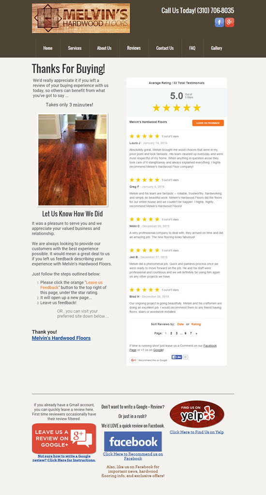
Example 1: Melvin’s Hardwood Floors
This page does a good job of showcasing other customers’ reviews / testimonials, of explaining the ins and outs of writing a Google review, of offering Facebook as a 2nd choice, and not being too pushy about filter-happy Yelp.
Example 2: McKinney Firearms Training
Several choices, links to instructions, and lots of evidence that other customers wrote reviews and that you should, too.
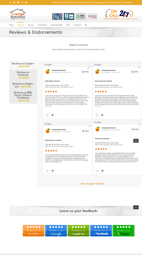
Example 3: Orange Restoration
Again, lots of social proof. Also, they picked review sites that are relevant to the remediation industry: Houzz, Angie’s List, and Thumbtack.
Example 4: Commonwealth Oral & Facial Surgery
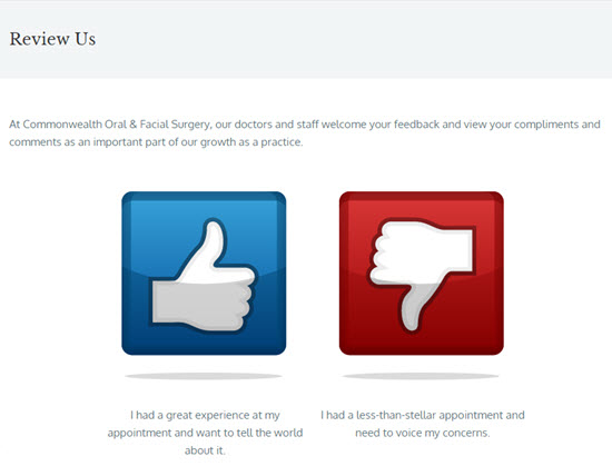
First they ask if you’re happy.
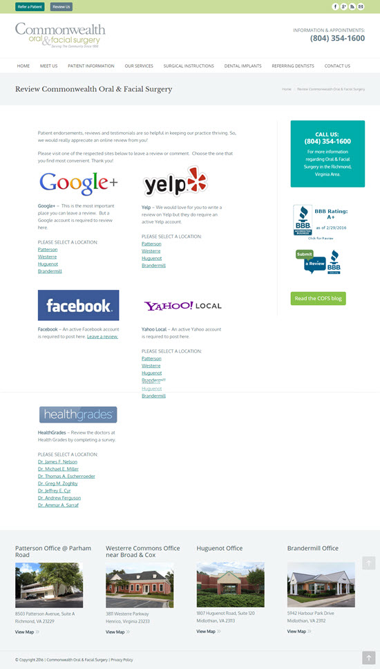
If you click the thumbs-up, here’s the page you see:
I like how they let you pick your location and doctor.
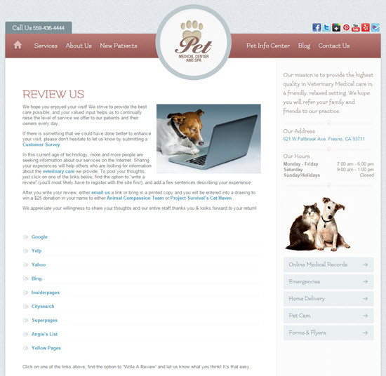
Example 5: Pet Medical Center and Spa
These guys do a great job of explaining why a review would be so helpful, and of making it seem too daunting. The doggie photo is a nice touch, too.
—
Do you know of any solid examples of “review us” pages? If so, what makes them good?
How well have they worked for you?
Leave a comment!
