It’s a shame so many business owners spend more time chasing shiny new objects than they do nailing the fundamentals.
Mess up your homepage and your local rankings won’t be all they can be, or you’ll scare away people, or both. It’s of outsize importance to Google and to customers/clients/patients. Craft an excellent homepage and you might give yourself wiggle room to mess up in other areas – and maybe for it not to matter as much.
In helping business owners make rain, I see and get to work on more homepages than your average bear. Here are what I’d consider the 10 most-common homepage mistakes, and how you can avoid making them:
Homepage mistake 1: It’s wafer-thin on content.
Most homepages skimp on info about specific offerings (services, products, treatments, or practice areas). Have at least a blurb on each offering you care about, and include links to the pages where you describe them in more detail.

Homepage mistake 2: There’s little info about the service area or locations.
You don’t want Google and customers to have to guess or dig to determine where you are or what areas you serve. Make it as plain as day.

Homepage mistake 3: It’s got no or too-few links to important subpages.
If you’ve got other pages you want visitors to see and for Google maybe to rank well, you’d best link to them. Maybe your most-important 5-10. I like bullet-point lists.
Homepage mistake 4: It’s been colonized by a slider.
Most sliders slow down the load-time of your page, push your strongest material below the fold, and are ignored by visitors. Consider taking yours behind the barn, or at least replacing it with a static image.
Homepage mistake 5: There’s nothing unique or compelling in the title and/or description tag.
Having your keyword(s) + city is not enough. Be a giraffe among zebras. Weave in as much of your USP as you can.


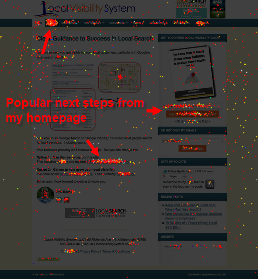
Homepage mistake 6: Not tracking visitors’ clicking and scrolling behavior.
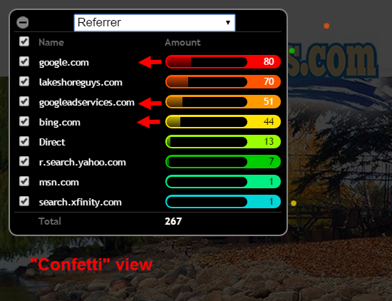
Use a tool like CrazyEgg or HotJar to determine which parts of your page visitors care about and which they ignore.
Homepage mistake 7: Clear calls-to-action aren’t in all the places they should be.
Having one call-to-action at the top and bottom of the page is a no-brainer. If it’s a long page, have a call-to-action somewhere in the middle. Because you’re tracking clicking and scrolling behavior (see above point), in time you’ll probably know which one pulls the most weight.
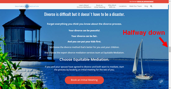
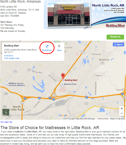
Homepage mistake 8: A functional Google Map isn’t embedded.
If you’ve got an office or bricks-and-mortar location, your would-be customers probably want to be able to pull up directions easily. Google may like to see driving-direction look-ups.
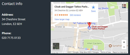
Homepage mistake 9: It’s filled with knickknacks for non-customers.
Links to social profiles, a “recent blog posts” section, etc. Eschew them – unless you want people to pay attention to those doodads and not call you.
Homepage mistake 10: It assumes the visitor saw the reviews.
Will your homepage impress a word-of-mouth referral or others who might have gone directly to your site without Googling you first?

Homepage mistake 11 (bonus): It’s too reserved.
Don’t assume everyone will even see other pages on your site. Make it very clear where visitors can get more in-depth info on you and your services if they want it, but don’t assume they’ll click or scroll. Say your piece, say it early, and say it plainly.

—
Any homepage mistakes I forgot?
Any you don’t think are mistakes?
What do you consider the most or least serious issue, and why?
Leave a comment!




 In the world of local search, GetListed is handier than duct tape and a Swiss Army Knife put together. It instantly analyzes how locally visible your business is and gives you specific recommendations for how to get more visible. Plus, the rest of the site contains some
  I had a brilliant idea: little buttons you could put on your website that customers simply could click to write reviews for you…but then I learned the chaps at
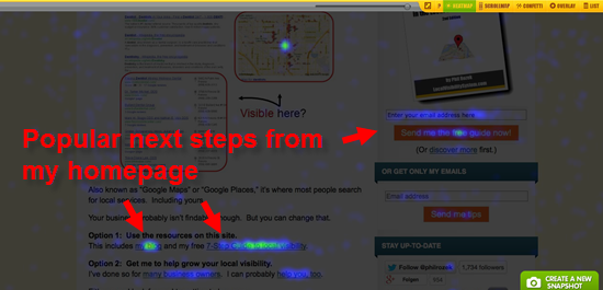
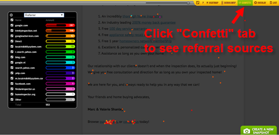
  A simple plugin-like tool that shows you a really sexy heatmap of where your website visitors click, the traffic sources those clicks come from, how far down the page they scroll, and other crucial intel.
 A screenshot tool and photo-editor wrapped up into one very handy bundle. You need