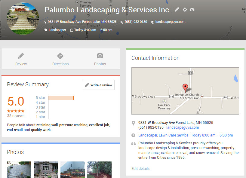
It appears that businesses’ Google+ Local listings have gotten yet another facelift. Now they’re laid out in two columns. Here’s what you see above the fold:
Lower down on the page, you’ll see double-barreled review action:
An early version of this new layout was spotted “in the wild” last week on Linda Buquet’s forum. It looks like the two-column layout now has rolled out more broadly.
I like the new look. Of course, the sleek new design would matter more if the “review pop-up” went away and more people actually ended up on businesses’ Google listings.
The main upshot of the new layout is that it highlights a business’s Google Plus reviews. The “Reviews Summary” box is now up near the top-left corner of the page, where – as most eye-tracking studies will tell you – people tend to look the most. Even more prominent is what’s right above the “Reviews Summary” box: a big “pencil” button that people can click on to write reviews.
Google is pushing reviews. Hard. This is just the latest in a series of moves by Google. Some highlights:
- January: relaxes the review filters
- May: begins rolling out “new Maps,” which lets the user filter search results so as to see only businesses reviewed by “Top Reviewers”
- Early July: reintroduces 5-star ratings system
- Late July: introduces the “popup“
- August: launches “City Experts” program
Google seems to be sculpting much of its Places/Plus/Maps results around reviews. I think they’re trying to tell us something.


