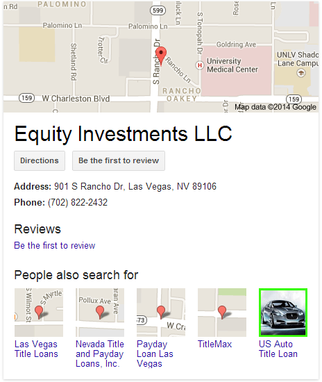
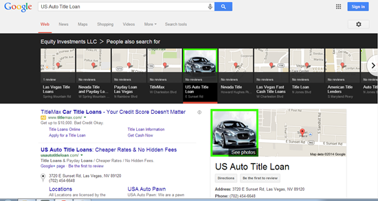
I was just going about my business, monkeying around in the local results. Then something caught my eye:

Given that Google just started testing green review stars, I could only draw 2 conclusions:
1. Google must think it’s St. Patrick’s Day, OR
2. I just stumbled across a crafty business owner.
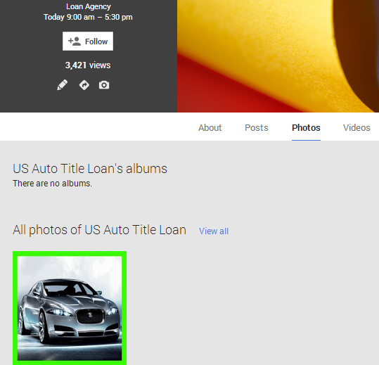
Looks like it’s the latter. Here’s what I saw when I clicked on the green-bordered photo in the knowledge graph:
Kind of stands out in that local carousel, doesn’t it?
I finally check out the business’s Google Places page. Doesn’t even have a profile photo. Our lucky green photo was simply the first and only one uploaded under the “Photos” tab.

Yup, it’s just a photo with a border around it. Not a layout change or pay-to-play scheme that Google’s testing.
As I’ve written, I’m convinced that user-engagement factors – especially how many people click on your listing – affect your rankings. What if people search for one business by name and immediately search for another by name (which is what a click on a “People also search for” image does)?
If I’m Big Brother Google and I’m looking at who clicks where so that I can figure out which search results are relevant, I might give an edge to the 2nd business.
Should you go as far as a fat, lime-green border on your photo(s)? Probably not. Just consider dolling up your photos a little, so they look good in that “People also search for” section.
