What’s a “blended review”? It’s where a customer writes a review of a business and uploads photos to that business’s Google Places page—which results in the review and pictures being “blended” in the review area.
I discovered “blended reviews” last week. Here’s the LONE example I’ve been able to find so far—for Mike’s Pastry in Boston (my all-time favorite):
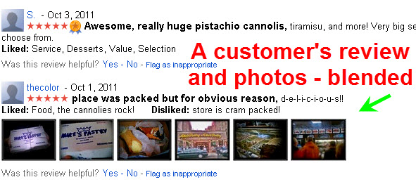
I want to learn more about these “blended reviews”—who has them, the kind of customers who leave them, how they’re ranked within the Google Places review area, etc.
Trouble is, I just burned out my eyeballs by spending way too long looking for another example of one. I came up dry, and will probably need to go buy a pair of Coke-bottle glasses after this.
That’s why I’m offering you a bounty. If YOU can send me a link to a business in Google Places that has at least one “blended review” (as described above), I’ll give you a free Google Places review handout or a “Best Ever” review handout.
Two caveats: (1) you can’t simply send me a link to your Places page (where it’s easy enough to get a non-customer to upload a review and photos), and (2) you can’t send me a link to a business that you reviewed and uploaded photos of.
In other words, it’s got to be a “blended review” that occurs in the wild—like of a business you’ve been to or stumbled across in Google Places.
Bonus: if you can find me a naturally occurring blended review that is NOT for a hotel, tourist attraction, restaurant, or any place that sells food or drink, I’ll give you a free Google Places review handout AND a handout for getting “Best Ever” Google reviews. What I’d love to find is a business in a service industry (landscaping, roofing, plumbing, etc.) or a profession (doctor, lawyer, etc.) that has a blended review.
Up to the task? In the words of Cosmo Kramer…giddy up!
Special thanks to Linda Buquet and Nyagoslav Zhekov, who clued me in to the extreme scarcity of blended reviews.
–Update (10/14)–
We’ve actually found a few more examples of blended reviews. Eric Marshall of ZCreative.com found this one.
I also found a couple of others (by the same user who did the blended review for Mike’s Pastry) here and here.
Notice that the blended reviews consistently rise to the top of the list of Google reviews. Sure, obviously Google considers them relevant reviews, because of all the bold keyphrases/sentiment fragments in the actual text of the reviews. And yes, Google does tend to put the more recent reviews at the top of the heap.
But based on even this little “core sample,” it’s pretty clear so far that Google gives blended reviews a spotlight. They’re inherently super-prominent just because they contain pictures—and Google is making blended reviews doubly prominent by featuring them at the top of the customer-review area.


 Credit cards you accept. Customers have to know how they can pay you—like whether they have to bring their checkbook or stop by the ATM. Especially now that you can’t specify “payment types accepted” on your Places listing, it’s smart to let customers know about accepted payment types sooner rather than later.