It’s a shame so many business owners spend more time chasing shiny new objects than they do nailing the fundamentals.
Mess up your homepage and your local rankings won’t be all they can be, or you’ll scare away people, or both. It’s of outsize importance to Google and to customers/clients/patients. Craft an excellent homepage and you might give yourself wiggle room to mess up in other areas – and maybe for it not to matter as much.
In helping business owners make rain, I see and get to work on more homepages than your average bear. Here are what I’d consider the 10 most-common homepage mistakes, and how you can avoid making them:
Homepage mistake 1: It’s wafer-thin on content.
Most homepages skimp on info about specific offerings (services, products, treatments, or practice areas). Have at least a blurb on each offering you care about, and include links to the pages where you describe them in more detail.
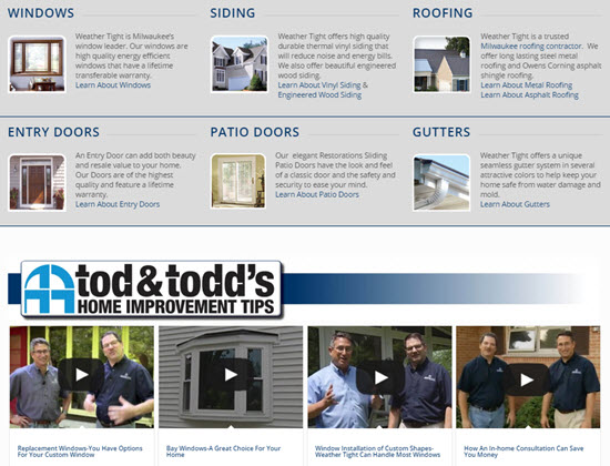
Homepage mistake 2: There’s little info about the service area or locations.
You don’t want Google and customers to have to guess or dig to determine where you are or what areas you serve. Make it as plain as day.

Homepage mistake 3: It’s got no or too-few links to important subpages.
If you’ve got other pages you want visitors to see and for Google maybe to rank well, you’d best link to them. Maybe your most-important 5-10. I like bullet-point lists.
Homepage mistake 4: It’s been colonized by a slider.
Most sliders slow down the load-time of your page, push your strongest material below the fold, and are ignored by visitors. Consider taking yours behind the barn, or at least replacing it with a static image.
Homepage mistake 5: There’s nothing unique or compelling in the title and/or description tag.
Having your keyword(s) + city is not enough. Be a giraffe among zebras. Weave in as much of your USP as you can.


Homepage mistake 6: Not tracking visitors’ clicking and scrolling behavior.
Use a tool like CrazyEgg or HotJar to determine which parts of your page visitors care about and which they ignore.
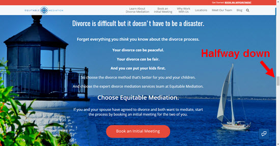
Homepage mistake 7: Clear calls-to-action aren’t in all the places they should be.
Having one call-to-action at the top and bottom of the page is a no-brainer. If it’s a long page, have a call-to-action somewhere in the middle. Because you’re tracking clicking and scrolling behavior (see above point), in time you’ll probably know which one pulls the most weight.
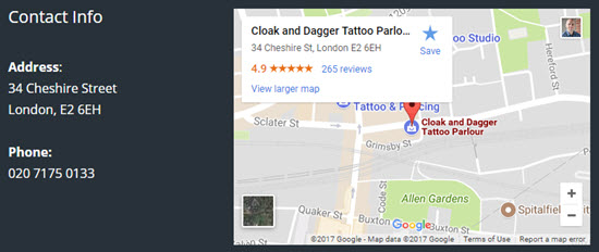
Homepage mistake 8: A functional Google Map isn’t embedded.
If you’ve got an office or bricks-and-mortar location, your would-be customers probably want to be able to pull up directions easily. Google may like to see driving-direction look-ups.
Homepage mistake 9: It’s filled with knickknacks for non-customers.
Links to social profiles, a “recent blog posts” section, etc. Eschew them – unless you want people to pay attention to those doodads and not call you.
Homepage mistake 10: It assumes the visitor saw the reviews.
Will your homepage impress a word-of-mouth referral or others who might have gone directly to your site without Googling you first?

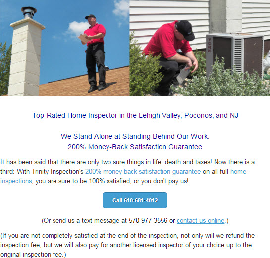
Homepage mistake 11 (bonus): It’s too reserved.
Don’t assume everyone will even see other pages on your site. Make it very clear where visitors can get more in-depth info on you and your services if they want it, but don’t assume they’ll click or scroll. Say your piece, say it early, and say it plainly.
—
Any homepage mistakes I forgot?
Any you don’t think are mistakes?
What do you consider the most or least serious issue, and why?
Leave a comment!

Instead of Crazy Egg I like to use the Google analytics chrome plugin. It doesnt have heat maps (that would be cool), but will visually display analytic information for tge website page you’re on. You can see %’s of click through rate for links and buttons on the page which I find helpful to determine how people are interacting with the page.
If that works for you, awesome. I’m fond of the heatmap tools.
Hi Phil,
This is a great topic and we see so often with clients! How many external links would you recommend so it is not overdone and should they be follow links? I hear from some in the industry to build relevance on more internal pages and spread the juice so you do not give to much away. What are your thoughts?
Again great topic because it the most important page on your site.
Thanks for sharing your knowlege!
Good question, Tim. Just however many pass the common-sense sniffer test. I never shy away from linking out when I’ve got a good resource to cite. I have not found that it “bleeds PR” or anything.
I like how you say the sniffer test. This is where I start to set up high relevance for the site. I use manufactures and high related content with high authority. You have taught me so much with local. Thanks!
Phil, a lot of the things to avoid are there because the web agencies wants to impress their customers.
Good point, Marc. But ultimately, the business owner is responsible for what’s on his/her site, and for determining that it helps someone besides the agency.
Hey Phil,
Many of my clients insist on the big image sliders – I think driven by the WOW factor.
I intend to setup an experiment with Google Optimize, which will hopefully corroborate my case against sliders. As you say, they wast resources and UX studies have shown they do not entice decent click-through metrics.
Great write-up, as always!
My clients want the same thing. Every time I try to build a site without sliders – I get the question – where are my sliders – so I don’t even argue with them.
I’ve been telling clients for a long time that the beautiful eye-catching full width homepage sliders they love so much are not doing much for their ranking. Still they persist. I have to admit that I give in sometimes but not before letting them know the potential downside. I’ll be more forceful about this going forward. Thanks for confirming a bunch of things I already thought were important.
I hear you, Marvin. It would be one thing if visitors could very easily tune out the slider, but often the slider is the only thing they see. It’s usually worse than useless.
I agree with the slider UNLESS its a USP that stands out or is building psychological authority over the customer and pre-framing them. IE…Over 525 Five Star Patient Reviews online or VOTED BEST STEAK by MIAMI HERALD.
I’m with you, Chris. It’s got to be a battle-tested USP, and something that’s crunchy and provable and falsifiable, rather than mush like, “We Care More!”
I thought Google did not like listing out the towns a customer services and could penalize them for stuffing. Can anybody elaborate on this?
I didn’t recommend stuffing in a list of cities/towns.
As you alluded to, that’s a dumb practice, though one Google doesn’t seem to do anything about.
Phil , Another mistake I often run across is the “we,we,we” syndrome. The focus of our content should be on the customer and how they can be helped, not how great you think you are.
I second that!
This would be a great post: How to write client-focused content for your local business website.
This is a great point, Mary. Too many businesses focus on what they think people want to hear rather than what is best for the customer and how they can have their needs met.
Excellent point, Mary.
I considered citing bad writing as mistake #1, but that’s such a big can of worms, and the bad writing is everywhere (though especially damaging on the homepage).
You hit it right on the head Mary. What’s worse is when you see clients with a homepage all about them and then it’s replicated right throughout their social media channels. Creates a very unattractive business in the consumer’s eye and then they wonder why they can’t convert.
Great points (as usual;)).
There’s an additional issue that’s been a critical consideration of mine lately which might enhance the list – MOBILE. Specifically, make sure your call to action is not hidden in a toggled menu, and even more importantly don’t force your mobile visitors to dig for your phone number.
I checked the Evans Law Group website above for an example, and it does a great job on mobile of keeping the phone number front and center. Thoughts?
Very good point, Kim.
Another one — auto-loading videos, especially if they are half way down the page.
Yeah, autoplay videos are awful. I considered including them as an “honorable mention.” Not as widespread a problem as the others (at least in my experience), but definitely a problem when present.
Great advice here, Phil. You mentioned the map, which is a good call. I also think that for single location businesses you want to make sure you have the NAP info on the homepage, because the homepage is likely the page that your GMB listing is linking to. Speaking of, I’m surprised you didn’t talk about and link to your post on when to link your GMB listings to the homepage and when to link them to a location page. That seems particularly applicable here. 🙂
https://www.localvisibilitysystem.com/2014/05/13/your-google-places-landing-page-homepage-or-city-specific/
Thanks, man. Good call.
Even for a multi-location business I’d have the NAP blobs down there.
I thought about mentioning the bit about landing pages, but (1) didn’t want to assume the reader’s “local” business is eligible for Google My Business, and (2) wanted to keep it focused on what’s on the homepage itself.
I like a Google Map on the home page, but I make it an image linking to the actual Google Map. A G Map on any page slows that page significantly and ads to load time. As G keeps pumping site speed, I’ve gone the image route. I’ve tested both ways and the image reduces load time by almost 1 second and reduces requests by nearly 100!!
Interesting stat, Brian. As long as it opens into a new browser tab, I’d say that’s a solid alternative.
Hey, sliders look great and can contain relevant information if you do it right. Good list overall for Local SEO.
Occasionally. Rarely, I’d say.
Hey Phil great Article. Just so you know you have 2 number 3’s.
Doh! Thanks for the heads-up.
Nice one, Phil. I remember Yoast’s article on sliders (the one you linked to) well. I also agree with Mary that businesses often forget to focus on what they are going to do for their customers and instead tell you how great they are which is just ego.
Another thing is a clear USP.
As always, when I read any articles like these, I now need to check my own and no doubt it fails on some of these!
The shoemaker’s son often goes unshod 🙂
You mention that sliders slow down the site speed but won’t adding a Google Maps do the same?
To some extent. They’re in an iframe, though, and should load asynchronously. Also, they’re usually way down the page, and won’t scare off anyone.
So love your stuff, thank you Phil!
🙂
Thanks, Linda.
Great post Phil. And thanks for including us an example of what to do (putting a CTA in the middle of a long page – #7) I’d add “not walking the visitor down a logical path, to get them the information they need, depending on where they are in their buyers journey.” Homepages by their very nature are welcome mats so they need to be a bit more broad than interior pages. But so as not to overwhelm the visitor, it’s important to present them with one option at a time as to why they may be there, and then give them something to do (i.e. a call to action) Then if that didn’t get them click, walk down the path to the next reason why they might be there and give them a call to action. Still no action? OK then, how about this? Is this where you’re at in your buyers journey? You are? Good! Here’s a relevant call to action. As soon as I see an unorganized page, trying to tell me too many things all at once, I click away. Make it easy for me to walk down the path, read what you’ve got to say and when I arrive at my destination, I’ll clearly know it, and know what action to take.
Well-said, Joe. You did a great job on your homepage (and on many other pages!).
Great advice, Joe! I see so many sites that are so overwhelming I’m not sure WHAT they do! And we all know, a confused mind says no.
Good post, Phil. #11 was my favorite. I find myself saying this to SMB’s all the time, “what do you want the user to do?”. So if it’s call or fill out a form, then make it easy for them. Form on the home page (if possible). Phone number above the fold and clickable, etc. Make it easy to get the action you want. And of course, as you said, give them the WHY right away.
Thanks, Mark. SMBs sure do lose focus from time to time (don’t we all?).
Great information Phil, I love the line “Be a giraffe among zebras”
Re Point 8 and Google maps, what is your preferred method of embedding Google maps? Would you do it with a plugin if on WordPress or is the cleanest option just taking the code and putting it on the page?
Hey Jamie,
I prefer grabbing the embed code. Clean and simple.
For a local business, the address and contact information is very important to be on the home page. Since we won’t assume visitors will go to other pages (like the contact us page), having the NAP information at the top or footer of the page is critical.
Great read. Thanks Phil.
Good point, Hani.
Enjoyed your article Phil. I’ve written an article about creditability and trustablity of a website and will link to your article, too.
As far as other things on home pages, it annoys me when I click on a link and it opens a new page … on the same website. Also to see too many boxes to click that go to too many parts of the website.
I looked at your list and saw a few areas that my homepage could use some attention. Fixed those. Thank you.
Have two more to do including getting ride of the slider and doing what it says differently. I’ll work on that.
Personally, I do enjoy and read sliders. Would keeping a slider matter IF your ideal clients read them, too?
@Maria
Opening a link into a new browser tab is good if you don’t want the visitor to have to hit the “back” button, or if what’s on the linked-to page is parenthetical to what’s on the current page. A good example is a link to “read our reviews.” Do you want people to read your reviews? Sure, but they don’t HAVE to. If they do and are impressed, you probably want to pick up where they left off on the original page.
As I mentioned to Christopher, in my book a slider can be fine if you have a way to gauge its effectiveness and have determined it pulls its weight.
@Maria
The CRO experts would argue that your visitors enjoying reading the slider might be a good thing but it might not, depending on your goals. If you want them to hang around and read it, then the slider might be a good thing. But if your goal is to get them to do something else but they become glued to an albeit amazingly attractive and interesting slider, then that might be holding them up from doing that something else. All these things are much easier to test on huge traffic sites by testing conversion rates etc. using different techniques.
Extremely well-put, Ewan.
Thanks Phil,
Great article.
Thanks
Joe@rahall.com
Thanks Phil, always a pleasure and helpful to read your posts.
I hate stock photos! Argh. I would have added this as a mistake.
A local business should be able to find some relevant images rather than use stock photos; do they think their visitors are stupid and don’t see through stock photos?
This is one way that will help them to differentiate themselves from their competitors.
I agree on sliders; after split testing, static image converts better.
I also don’t like parallax images for the same reason; they distract visitors versus getting them to take the action you want them to take.
Load speed is important: if images are not compressed it slows down load speed.
To prove this to clients and get them to change image heavy pages I put their website through Google Page Speed Insights: https://developers.google.com/speed/pagespeed/insights/
This is not me versus the designer, this is me explaining to the client how Google views the loading speed of their pages, in terms of ranking the page. Load speed is now part of their algorithm so it’s important.
I win every time!
Great call on the stock photos, Michael. The best-case scenario is the visitor just ignores them. More likely, their cheesiness sticks out like a Super Bowl ring.
Parallax design does fall into the gimmick bucket most of the time. But it makes designers feel warm and fuzzy and important.
It’s not easy to talk clients out of having home page sliders (when all their competitors usually have them) … I do insist that if I have to build sites with them that they have a strong call to action on each slide. Whilst I agree with the Google Map on the home page, it is often one of the slowest loading items according to GT Metrix reports – especially problematic if clients are testing page load times 🙂 Great article as usual tho’
Not a bad compromise on the slider, Alan.
Great article, Phil. I’m not sure about #9. Sure we want to keep visitors on our site; however, wouldn’t you want a non-customer to see additional info to learn more (on social sites or in your blogs)? Or did you suggest this because this homepage/site should be giving them enough info to keep them here to take action? Would you suggest putting social links elsewhere, maybe on a Contact Us page as opposed to the homepage?
Great article, Phil!
Is it okay if a website has an embedded map, but it’s on either the Contact Us page or a separate location page? Also, will you give a few more examples of when it’s a good practice to link internally to a page on a site verses having a page open in a separate tab? Thanks! I always enjoy your articles 🙂
Hey Sarah,
I’d say an embedded Google Map should go wherever would-be customers find it most useful. It’s usually handy on the sorts of pages you mention.
Rarely do I have internal links open in a new tab. (Mostly just in cases where the linked-to content is a real “aside,” like if you’re linking to a page that shows your license.) I mostly have links open new tabs if those links point to a site other than my client’s site.
Phil, do you have any websites of local business that you think really nailed the homepage from design and purpose of getting the potential client to take action?
Tons. Tons of examples. Here’s one for now, though: https://www.evansfamilylawgroup.com/
“Homepage mistake 8: A functional Google Map isn’t embedded.”
Does a Google MyMaps iframe with multiple locations perform any less well than the typical one pin embed?
If they’re both iframes, no.