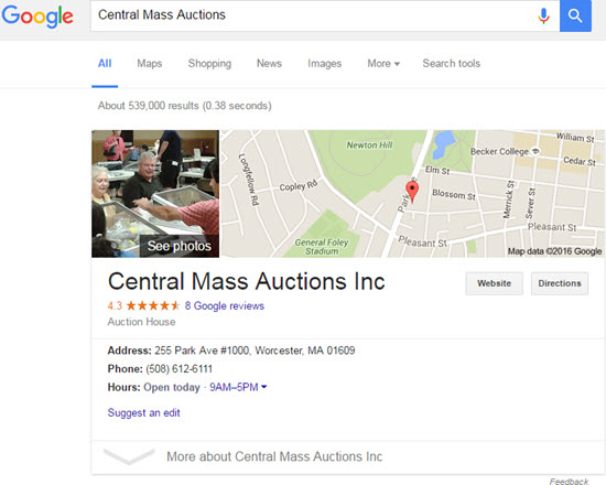
When you search for a specific local business, you may no longer see the knowledge graph appear in the right-hand sidebar. Google appears to be testing its position on the SERPs.
The knowledge panel has moved to the left and fully above the fold. It’s gone from shy prince in the margins to turkey-leg-chomping king in the middle of the court.


Of course, after I went to all the trouble of writing those two paragraphs, the knowledge graph moved back to the right.

And now I’m seeing the new layout again.
It seems to be another of Google’s tests, but it may be the start of a permanent change.
It may be partly for user-experience and to show local “one-box”-type results in a way similar to how they appear on mobile (that is, front and center). I’m sure it also fits into another of Google’s schemes to squeeze out more AdWords revenue, though at this point it’s not clear to me how.
What would a bigger, bolder knowledge graph mean for you, the business owner? Probably nothing you weren’t aware of already. But if this change sticks, your Google reviews will get even more noticeable, important, and worth working on.
—
Have you seen this larger, shifted knowledge graph when you search for a company by name?
What do you make of the test? What do you think Google is trying to accomplish?
Leave a comment!
This is a super cool change! And it has significant impact when you score a local one-box for a non-branded term, such as https://www.google.ca/search?q=trampoline+park+austin
But then again, it could suck when it’s the spammers that are scoring the one-box.
Still, I hope this test sticks. It’s a better user experience when you’re looking up a specific business.
Ain’t that the truth!
Since there is little on the right side except the KG now, perhaps Google will start testing various full width layouts for desktop. This meshes with the recent changes in title tag length and testing of material design layout. Or they could just abandon that space on the right in favor of making desktop more consistent with mobile, as you say.
Good call, Rich.
Good catch Phil. Like Darren said, this is a solid change for the purpose of looking at a specific business. My thought is G will abandon everything on the right side bar to make the desktop experience match mobile. That seems to be the way they are going with everything.
Ive tried replicating those searches today and am unable to, btw.
That’s what I’m guessing, too.
Yeah, the test has been on-and-off.