
Having a solid “Review Us” page can help you rack up reviews on the local review sites that matter.
When you ask customers / clients / patients to review you, you can send them to a simple URL on your site, where you ask for feedback and give them a choice of review sites.
If it’s a page that’s visible to non-customers on your site, and if it shows off the reviews you’ve already got, it’s a great social-proof element that can win those people over. It can also “condition” those customers to write you a review, in that they’ll probably expect you to ask later.
But of the few business owners who are gung-ho enough to put together a whole page for encouraging reviews, even fewer actually build good pages.
That’s why I’ve rounded up a few examples of well-built “Review Us” pages. I’ll go light on the explanation; be sure to click the links, so you can draw your own conclusions and get the creative juices flowing.
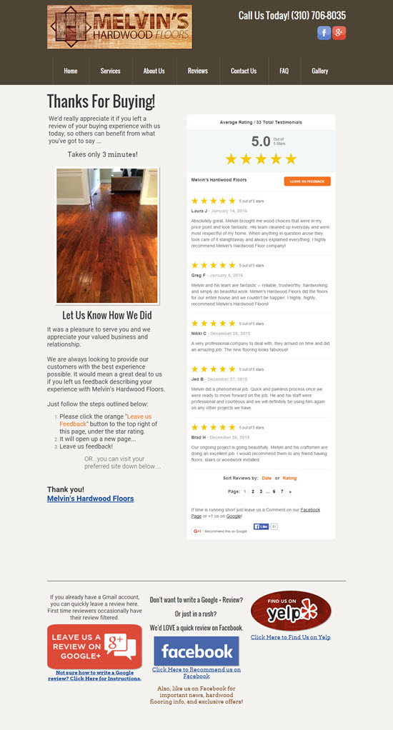
Example 1: Melvin’s Hardwood Floors
This page does a good job of showcasing other customers’ reviews / testimonials, of explaining the ins and outs of writing a Google review, of offering Facebook as a 2nd choice, and not being too pushy about filter-happy Yelp.
Example 2: McKinney Firearms Training
Several choices, links to instructions, and lots of evidence that other customers wrote reviews and that you should, too.
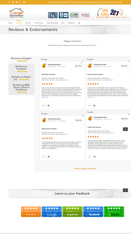
Example 3: Orange Restoration
Again, lots of social proof. Also, they picked review sites that are relevant to the remediation industry: Houzz, Angie’s List, and Thumbtack.
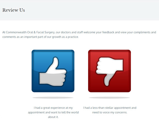
Example 4: Commonwealth Oral & Facial Surgery
First they ask if you’re happy.
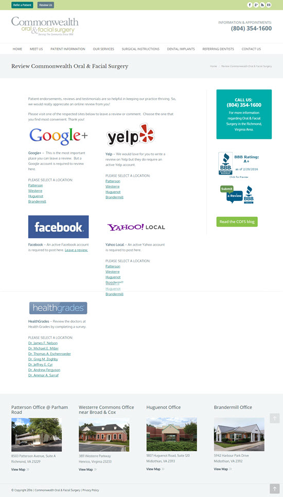
If you click the thumbs-up, here’s the page you see:
I like how they let you pick your location and doctor.
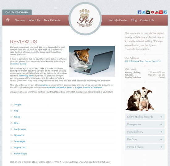
Example 5: Pet Medical Center and Spa
These guys do a great job of explaining why a review would be so helpful, and of making it seem too daunting. The doggie photo is a nice touch, too.
—
Do you know of any solid examples of “review us” pages? If so, what makes them good?
How well have they worked for you?
Leave a comment!

Example 4 is the best imo. Review funnels are great. If someone has an issue, it gets to you first rather than it hitting a review site and you finding about it later. By then it’s too late to correct a wrong and persuade someone of probably not writing that negative review (persuade as in offering good customer service to right a wrong, not any unethical stuff). You have time to fix the issue. It can also give someone an outlet that might be too scared to write a negative review w/ a low star rating or just not knowing how to write a review on a review site. For the more serious negative issues, I don’t think people care too much and will write the neg review regardless.
I think they used way too much padding though. You should give the user an option to be taught how to write the review as not everyone is savvy in that department. A link that goes straight to the review site (or even better, a page w/ the service iframed (if that’s allowed)) and another link that embeds a “how to create your account and write the review tutorial” video w/ the review site also linked on that page.
Some people also might forget to write a review (unless they had a above and beyond experience or a very negative experience). Email signatures are a useful tool to get people to the review area of your site (IE: an email signature that says “rate your experience with us” or ETC).
Just my 2 pennies.
Good points!
I agree with this. We created a page which has instructions for how to leave reviews but an Iframe might be worth checking out like you mention. Since the review sites and process to leave a review changes all the time we opted for a web site instead of a flyer or printed material.
https://www.virginiabeachtreecare.com/review/
I’ve been telling clients of ours to tell people the URL when they come across happy customers as the page isn’t linked to from the sites navigation or anywhere else on the site.
Great post Phil, simple but good examples. Love the doggie photo! But do you think their offer to donate on your behalf constitutes an incentive?
Thanks, Tony.
Yeah, I think the donation offer technically constitutes an “incentive,” but in this case I say, “Who cares?” Why? Because it wouldn’t cause the customer to write an unnaturally favorable review. He/she can write a review with the doggies in mind, and still rip you a new one.
No matter how you see it, you have to be really confident in your service when it comes to reviews. For example, if I just started a business and do not have enough experience within the field, I would never create a review page. But I totally agree that these reviews can benefit you in most of the cases. They can give you the necessary hints for improving your business. I agree with HelloKitty, example number four is really good.
I know what you mean, Nikolay. But one issue is that sooner or later you’re bound to get a bad review or three – whether you’ve got a “Review Us” page or not. That’s why it’s important to be proactive about encouraging reviews before you really need some good ones. Putting your request and some simple steps on a page can help with that.
I like the one here on shoeboxed.com.
https://www.shoeboxed.com/reviews/
Very clean, well-organized, and the inclusion of high-quality photos help to convey the scope of how many small businesses the app helps. The ‘Tweets from Customers’ section is also a nice way to highlight social media proof.
It’s a nice testimonials page, but it’s not a “Review Us” page.
I love real-world examples! What a nice collection, Phil.
Thanks, Miriam!
Example #4 is nearly identical to how the site grade.us works. They have different versions and styles and implementations available but essentially, the script shows a user a “thumbs up” or “thumbs down” and if the user selects the thumbs up, they are directed to leave reviews (with instructions) on the sites the account admin selected. A thumbs down redirects the user to bing 🙂 haha
I’m aware.
I loved the first example from Melvin’s Hardwood Floors. The overall design is clean and has only what it needs to have, the review page is also using Schema markup which can help for search rankings, but the only negative thing is not being mobile-friendly. Nowadays for a local business (and in general) that’s a must have.
Agreed with what HelloKittySEO said about funnels:
“If someone has an issue, it gets to you first rather than it hitting a review site and you finding about it later. By then it’s too late to correct a wrong and persuade someone of probably not writing that negative review (persuade as in offering good customer service to right a wrong, not any unethical stuff). You have time to fix the issue”
Another one is this review hub, not exactly a “Review Us” page (because they seem to be using an email funnel) but an example of having a SEO friendly microsite for a local business: https://alpinephysicaltherapyreviews.com
Yes! I like these examples. I have clients of mine which have a hard time getting reviews at all so we setup a review us page for them but many of those clients believe their older generation doesn’t know how to leave a review on Yelp or Google so we created a page for just that. It walks the customer through the process. https://www.virginiabeachtreecare.com/review/
I’m curious if people have tried this method verse the examples shown here where there’s reviews shown from others and just links to the review sites. I wonder which page setup has a better conversion.
Nice page, Adam.
Two problems: (1) active Yelpers don’t need instructions on how to post a Yelp review, and non-active Yelpers’ reviews usually get filtered, and (2) you need a third, very easy-to-use option – like Facebook.
Thanks for the reply Phil.
1) Reviews on Yelp don’t always stay “not recommended”. Non-active Yelpers might get filtered in the beginning of a new membership but it’s not set in stone especially if the new user starts using and adopting to it.
2) I could be wrong but personally I never go to Facebook to find a service or product and I certainly don’t go there for reviews.
1. I’m well aware:
https://www.localvisibilitysystem.com/2016/02/11/yelp-elite-for-3-years-with-only-66-reviews-how/
https://www.localvisibilitysystem.com/2015/04/23/20-plus-depressing-observations-about-yelp-reviews/
2. That’s true of you and me, but we are not your customers. Plus, sometimes it’s a choice between getting a review on an easy site and not getting a review at all.
Phil – What review tools are these sites using? Do you have a prefered tool to use?
I use https://5starrocket.com for my clients, it has automated funnels and includes a review hub for each account.
I believe example #1 is the only one that uses a tool, which in this case is Whitespark’s Reputation Builder.
You can also use Grade.us to build a nice review funnel / page.
For me orange restoration is the best, it is simple and very easy to read. My eyes is not bombarded with images and flashing picture. Great design.