There’s no reason you can’t have a slick and benefit-oriented cover photo on your Google+ Local page. You don’t need to be in a “cool” industry, or have a nice building, or be in a scenic location.
The photo is one of the few parts of your page where you can get creative. You can convey more about what you offer. You can also create a mood or tell a story.
Why bother? Because any rankings you have are a waste if your page doesn’t make anyone pick up the phone or click through to your site.
I’ve rounded up 10 examples of nice cover photos. See what gets your creative juices flowing, or see what ideas you can swipe.
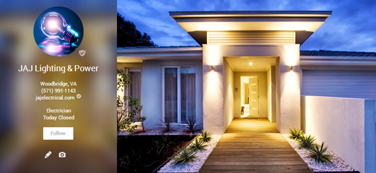
JAJ Lighting & Power (Woodbridge, VA)
Sure, it’s a nice house. But the timing makes this photo. If it were daytime the lights wouldn’t be on, and we couldn’t see the “product.” If it were nighttime the photo would lack color and we couldn’t see how the whole house looks with the lights.
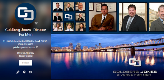
Goldberg Jones – Divorce For Men (Portland, OR)
Goldberg Jones know their audience and its pain-points. By including prominent pictures of the attorneys, the message is, “Hey, we can help a brother out.” The picture of Portland adds some sleekness, and makes it so the photo isn’t just mugshots.
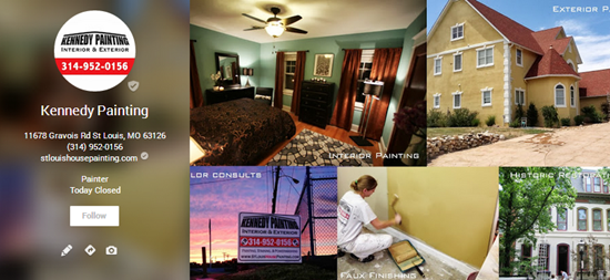
Kennedy Painting (St. Louis, MO)
The photo isn’t just of the outside or inside of a home. It showcases all the main services. The labels are a nice touch, even though they’re cut off.
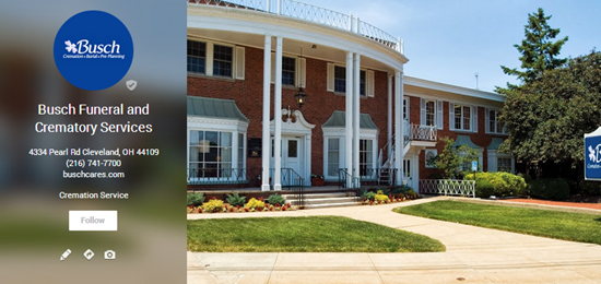
Busch Funeral and Crematory Services (Cleveland, OH)
This is a funeral home. Most “clever” photos would offend someone. Or bore them. It would have been so easy not to bother.
Busch did two smart things here: (1) they didn’t take a photo that conveys what they actually do, and (2) they had the smarts to take the photo outside on a nice day.
I give them extra points for capturing a little bit of their sign in the photo – to show it’s their funeral home and not the one down the street.
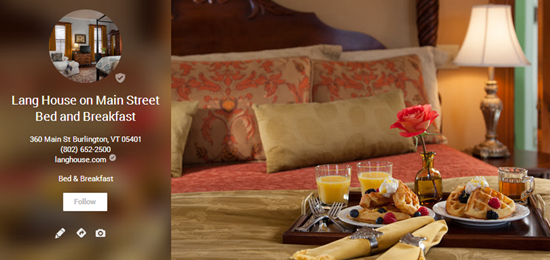
Lang House on Main Street Bed and Breakfast (Burlington, VT)
Most bed-and-breakfast places just have a photo of the bed and its hospital corners. If you just looked at the photo, you couldn’t tell them apart from a hotel (or no-tell motel). These guys actually went to the trouble of preparing a nice breakfast for their photo.
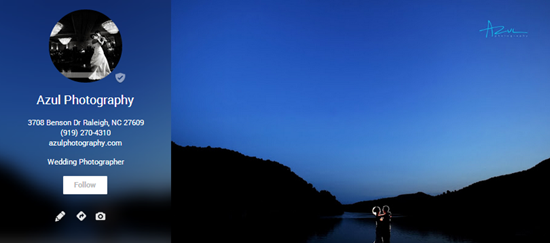
Azul Photography (Raleigh, NC)
This one’s brilliant. The blue sunset reflects their branding (azul). It also doesn’t show the couple in so much detail that a potential client who’s looking at this page would think, “Oh, that doesn’t look like us.” It’s also not overtly wedding-specific, so it wouldn’t make someone who wants a photographer for another occasion think that Azul only does weddings. I could go on and on about this one. It’s resourceful and effective.
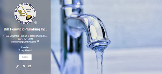
Bill Fenwick Plumbing Inc. (Jacksonville, FL)
It’s not the plumber or his truck or a dingy photo taken under the sink. It’s not a dripping faucet – which would highlight the problem. It’s a running faucet – which is the solution and the plumber’s promise.
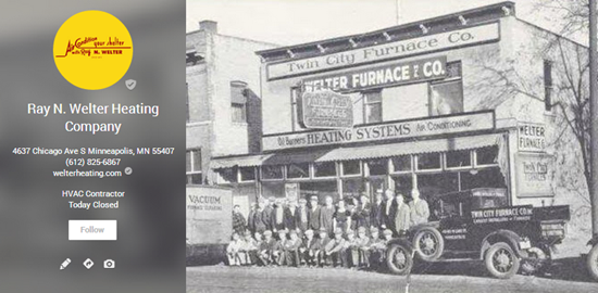
Ray N. Welter Heating Company (Minneapolis, MN)
This one tells a story. To start with, the place has been in business a while, and it’s gone through at least one name-change. But the family name is still in there. There’s much more story in the photo, which you can extract if you look it for long enough. Suffice it to say it adds a ton of credibility.
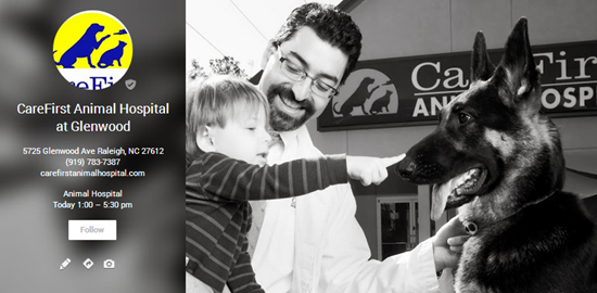
CareFirst Animal Hospital at Glenwood (Raleigh, NC)
You’ve got a healthy-looking dog, a happy kid, a friendly-looking veterinarian, and the front sign in the background. Whoever took this photo is a pro’s pro.
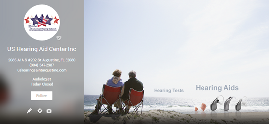
US Hearing Aid Center Inc. (St. Augustine, FL)
Hearing aids aren’t much to look at, so this photo doesn’t focus on them. The focus is on the people in the photo listening to the waves, and presumably talking to each other. It shows them with dignity. There’s a lot more going on in this one. It may be the most resourceful cover photo I’ve seen.
—
You just need to think of something simple and easy on the eyes. Then either spend a little time to do it right, or hire a professional photographer.
It doesn’t need to be stunning. I know there are splashier photos out there than the 10 classy ones I’ve shown here. But these are good because, although they look nice, they’re actually doable.
That’s why I tried to focus on the less-sexy types of businesses. You’ll notice that I didn’t include restaurants, casinos, or nightclubs. I don’t want you to have an excuse not to do this simple step. It will help determine what you get out of your local rankings.
I’ve gleaned a few lessons from these cover photos:
Lesson 1. It doesn’t need to be one photo. Collages work. They let you add color and say more.
Lesson 2. It doesn’t need to be a photo of your product or service. Maybe it shouldn’t be. (See my examples of the divorce lawyers, funeral home, and hearing aid supplier.)
Lesson 3. You can – and probably should – add some branding without letting your sign or logo hog the entire photo.
Lesson 4. Annotations can help.
Lesson 5. Consider black-and-white.
Enough about what I think.
Any ideas for a new photo on your page?
Know of any great cover photos?
Can you think of general rules for what makes a nice photo?
Leave a comment!
Phil – any ideas on best size of image when creating? I’ve adhered to the “cover size” rule and I can never get the image correct- it’s discouraging. Your examples are great. Now – to be able to create one that actually fits this awkward space.
Also, what program are people using to create these great cover(s)?
You’ll want to refer to this post, if you haven’t seen it already:
https://www.autorevo.com/blog/new-google-plus-cover-image-size/
As for how to avoid having parts of the photo get cut off, I’d just try to make sure all the important stuff is in the middle.
Not sure about the program. I use SnagIt for everything. Then again, I’m not a great photographer or design guy.
I love custom cover photos – but its so annoying that Google chooses the image behind the listing information. A great photo may look good on one side – but awful on the other.
Very true. I don’t like how Google cuts off the left edge. You pretty much always need to use a matte.
Great! I loved this because I could actually see what was right and wrong rather than just reading some tips. Show rather than tell! Brilliant.
Thanks, Mark!
I love it! It’s not something that businesses think about, but Its worth spending a few minutes playing around with it. I had a lot of trouble formatting my Google Plus cover image to fit properly, etc… one thing I learned is that the way it feeds is affected by the browser it is viewed on. I incorporated some text into my photo, and on Explorer it hangs a bit to the left, and on Chrome and Firefox it hangs to the right, so play around and try not to put anything very important on the right or left edge. https://plus.google.com/109954215177445912346/about
That’s a really nice photo, David.
Great article Phil. Definitely worth the time and effort to differentiate your local listing. Just curious…what is your opinion our page cover. https://plus.google.com/u/0/b/111165352546488358376/+Foxxr/about
It’s a clever photo, Brian. My main gripe is it’s a little too cerebral. The viewer can “get” it, but probably not get excited about it.
The photo is cut off on the left side when I look at it in the 2-column layout.
Thanks for the feedback Phil. You are so right. We changed it and went with an image that ties into our tagline. https://plus.google.com/b/111165352546488358376/+Foxxr/posts
I really like that, Brian. Clever.
Great creativity and thinking outside the box. This touches the emotional side of the buying decision and would think it will work very well. Especially if the picture is solving the viewers needs.
Thanks, Timothy.
Great Post! This is a huge opportunity often missed by most business owners. Your post gives a great summary of how to think through which photo you’ll use to showcase your brand on Google. For each potential candidate an owner should ask themselves the following questions? How does this picture tell the story of my business? Does it highlight a problem we solve? Does it paint a picture of the benefit we deliver? Does it offer proof we can do what we promise? Is there a relevant emotion conveyed that would make our brand more memorable? If the photo does one or more of these then it’s a winner. If not choose a better one.
Those are great guidelines, Charles. Thanks!
Great article and so important – we talk about the profile photo and cover photo in our Google+ Trainings. We created a cover photo for our local business page a while back, but need a new one – more professional looking – you have some great examples. Thanks! We just created a Brand Page (not local) for our DMS Pagelines part of the business which is doing great. This cover photo was done and PPT and we are happy with it. https://plus.google.com/b/109895245246204931499/109895245246204931499/posts
Now to get +1 and followers – much harder to get them on the Pages than a Profile page. A great cover photo will help, but you also need to post unique content of value on your Page. Our Google+ Local Page is doing well with followers and +1s, but takes time and a lot of engagement, participating in communities, doing hangouts, etc. to get them. With a your Google+ Local Page you get a Badge that you can add to your website – the badge looks so much nicer with a great cover photo and people can follow you right from your website if they are on Google+.
By the way, I just looked at your cover photo, it’s great! https://plus.google.com/b/113692101513859585235/+Localvisibilitysystem/posts
I love that you did it on your town. You have a new follower – elSue!
Thanks, Susan. Good call about the badge.
Ah, yes…my Google+ Local listing. I spend no time on it. The shoemaker’s son goes unshod, I guess.
I understand Phil, I way behind on a blog post for our website! I spend too much time on Google+ : ).
Gotta flip those priorities!
Hi Phil
great to read your article on the giant google photo. all the articles on google local have been good, prompting me tp sort my listing out.
when i visit my places page and click photo the responce is no photos available when i have photos on my google listing.
Also how do i edit the main cover photo?
regards
john hill
You need to sign in to your Plus page, then go to the public-facing page (here, for example), hover over the photo, and select “Change cover.” Somewhere along the way, you may be asked to “Manage this page” (in which case you’ll want to press that button).
I really like this post. There are so many areas that can distract business owners but if you don’t look professional on all your SM sites- people will second guess if you are really in business.
Thanks, Alana. Great point. It’s another “sign of life.” (I’d like to do a post on that some time.)
Please do! I want to read it. This is something we’ve been struggling with – being so busy improving our client’s brand that we don’t have any time to dedicate to our own.
10-4. Thanks for that “vote,” Anna!
Beautiful selection Phil,
So interesting actually, I would love to read a follow-up post on a no-no G+ cover photos:) I have seen some pretty scary cover pics of before and after pics for dental clinics that should definitely be avoided even if they are used as a common tool towards showing off one’s personal expertise and skills.
Thanks, Nevyana. I might eventually do a post on photos you do not want. That had occurred to me. Of course, there are so many bad ones that it’s hard to choose!
Great article Phil!
A question though if I may…the bed and breakfast Google+ local page that highlighted has a neat feature allowing users to make a reservation. From my understanding it’s an open table integration. Do you happen to know how to integrate such a feature?
Thanks!
Great question, Edgar. No, I don’t know to integrate OpenTable. But I imagine all you have to do is set up a listing there and allow for reservations to be taken, and Google does the rest. Just my hunch, of course.
Some great examples, and I think showing these to client will finally get them onboard with customizing their page.
It really is perplexing why goggle won’t just give a definitive size for these though.
Yeah, Google makes it a PITA. And it’s hard to get a photo that looks good in both the 2-column and 3-column layouts.
Just came across a nice one where they use a panorama photo to show off the restaurant:
https://plus.google.com/107866991293114633343/posts?hl=en
Damn…that’s nice. Good catch, Mr. Shaw!
I also love how they featured the reviews in the “Posts” stream.
Great page.
Oh man! I didn’t even notice that. They simply share their own reviews. Very smart.
Having worked with hundreds of restaurants in the past, the owner really needs to be on board with taking high res photos of either their food or the interior. This is a great example of one owner on-board with showing off their restaurant well. Clever with the re-sharing of reviews too 🙂
Thanks, Jackson.
Great article. What do you think about this one ?
https://plus.google.com/107415378284822541129/about
We didn’t clean up the studio to show that this is the place where we do the work (sorry for my bad english)
That’s a great photo, Stefan. It’s candid.
I agree, these cover photo’s are a great way to show off your page a bit. I always have my graphic designer create awesome covers for me and my clients. The current size of the Google + background image is much bigger than the one that was previous.
Good call, Tyson: having a designer do it is wise.
My fault a typo. I meant the current size of the Google + cover images is much BETTER, not much bigger. the old one of course was much bigger, and was just plain dumb lol.
Gotcha 🙂
Phil, would you take just a second and critique my cover photo? I don’t have any fancy photo editing software but if I need to I might can hire someone to dress a photo up for me a little more. Thanks and great article!
https://plus.google.com/b/110139041925292137317/dashboard/overview?hl=en#+AquaTekExteriorCleaningLLCPurvis/posts
The photo isn’t bad: a nice, clean house. But the photo doesn’t stand out in any way. That house could be anywhere. It would be better if you or one of your workers were in the picture – (1) so it doesn’t look generic, and (2) to show the results of your pressure-washing. You might also want to show the work in-progress, so the viewer can see the dirty part next to the clean part.
Thank you for this very good article, especially now that Google is starting to put local page views next to the +1s. I find that the cover photo is a good way to create a first impression and stand out among other local businesses. As far as engagement, I’ve found it helps to re-share once in a while on my plus page. Thanks for the awesome info Phil.
Very true, Frank. Thanks.
Some of these look amazing and I’m now inspired to do something classy aswell. Thanks for sharing!
Great post Phil.
“You can also create a mood or tell a story” Can’t agree more with this statement. Before the existence of the cover photo there was no way to stir those emotions when someone arrived at your G+ Local page. The right cover photo adds that magic touch.
Thanks, Colan. Very true.
Hello all,
This is my Google Plus business page – https://plus.google.com/u/0/+Smbybestcleanerwichita/about
I can see in all given above business pages that they all have contact address and phone numbers on top of the page, right side of cover photo.
I tried a lot to also display my contact address and business phone number same as they did, but i was not able to do so.
can anybody please tell me how can i display my phone number and contact address on top right side of cover photo in my business page.
That’s not a local Google+ page. This is:
https://plus.google.com/106874994446463747394/about
As for getting your contact info in the photo, it’s just a matter of editing the photo itself, and of playing around until it looks OK.
Thank you Phil for your reply. 🙂 The link you have given is not created by me. But i want to look my page same like the page given by you. I did all type of setting but still not got success. 🙁
No problem, Mike. Many Google pages are automatically created. Long story. You’ll probably want to claim that page, so that you can get it looking nice.
OK Phil. Thanks You 🙂