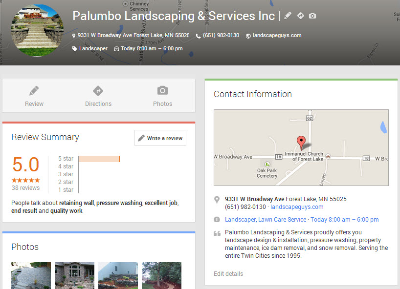
It appears that businesses’ Google+ Local listings have gotten yet another facelift. Now they’re laid out in two columns. Here’s what you see above the fold:
Lower down on the page, you’ll see double-barreled review action:
An early version of this new layout was spotted “in the wild” last week on Linda Buquet’s forum. It looks like the two-column layout now has rolled out more broadly.
I like the new look. Of course, the sleek new design would matter more if the “review pop-up” went away and more people actually ended up on businesses’ Google listings.
The main upshot of the new layout is that it highlights a business’s Google Plus reviews. The “Reviews Summary” box is now up near the top-left corner of the page, where – as most eye-tracking studies will tell you – people tend to look the most. Even more prominent is what’s right above the “Reviews Summary” box: a big “pencil” button that people can click on to write reviews.
Google is pushing reviews. Hard. This is just the latest in a series of moves by Google. Some highlights:
- January: relaxes the review filters
- May: begins rolling out “new Maps,” which lets the user filter search results so as to see only businesses reviewed by “Top Reviewers”
- Early July: reintroduces 5-star ratings system
- Late July: introduces the “popup“
- August: launches “City Experts” program
Google seems to be sculpting much of its Places/Plus/Maps results around reviews. I think they’re trying to tell us something.


Actually, it’s not only 2 columns, but the number of columns varies, when you change the width of the browser window.
What’s more remarkable, is that the order of the content changes, as the width changes:
1-col: contact info 1st, review scores 2nd, pictures 3rd
2-cols: review scores 1st, contact info 2nd, pictures 3rd
3-cols: pictures 1st, contact info 2nd, review scores 3rd
Could this have to do with:
1-col: people need contactinfo / map first as they search from a mobile device
2-cols: people do research and are in need of reviews for their process (most likely from a tablet)
3-cols: people want to get an impression through pics first, prior to continuing their search process
???
Am curious about your opinions…
Regards, Eduard.
Great analysis, Eduard. Thanks.
I did notice that there are three columns if you zoom out in the browser. I probably should have referred to it as “multi-column layout” in the title of my post!
Good spot Phil and thanks for posting. Can confirm I’m also seeing the new layout here in the UK. Brings things a bit more inline with mobile/tablet views, quite like it!
Thanks for the UK intel, 007!
Colan just reported at my place and Phil confirmed that the changes rolled back and now we have the old design again.
I just checked and that’s what I’m seeing. Update flew the coop.
I think it will be back though. Anyone still seeing it?
I see this exact same comment on Mike’s blog, but it’s relevant 🙂