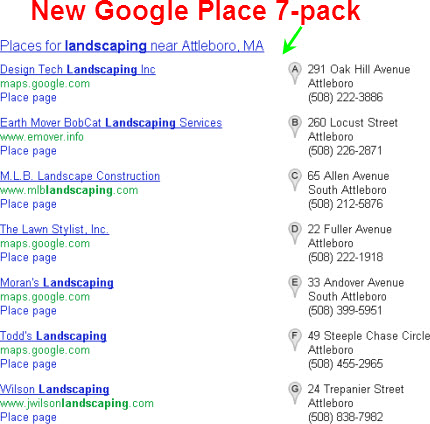
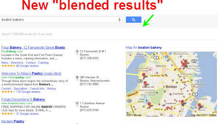
Google has once again tested VERY different layouts for the Google Places local results.
This particular test lasted a few hours in the wee hours today (October 29) but features several elements that having been popping up in Google’s tests recently.
It included a new look for the “7-pack” Google Places results…
…and for the “blended” local results:
Most notably, it’s the second short test of the new map layout that I reported on recently, and it contains the gray map markers that Jo from LollipopLocal and Nyagoslav from NGS Marketing noticed (mainly in Europe) last week.
I didn’t notice any reshuffling of the rankings, nor anything to indicate an algorithm change; the test layout is pretty much just a facelift.
Or…is it just a Botox injection into the ever-changing face of Google Places? Both new layouts are far less colorful—no red map markers or photos—even though they hog more above-the-fold space than before.
Google has now tested both the different map layout and the gray map pins twice in the span of a couple weeks. My guess is that in the very near future Google will stop messing around and will actually roll out a new Google Places layout.


Hey Phil!
And this morning I woke up to a brand new Google Places dashboard here in the UK! Click on my name above for the full details 🙂 The old dashboard is still there but on this one there is a fabulous new check box to say that you want them to email you with any changes or if they need any more info.
Very interesting…thanks!
Note to anyone reading this: in case you want to know more about this dashboard update (currently in the UK, maybe in the US at some point), see https://lollipoplocal.co.uk/google-places-uk-dashboard-update
The check box is to request an email when the edit is reviewed…
Phil, Mike Blumenthal tells me that what I thought was a new dashboard is actually the form for the new Community Edit feature where anyone can make a change to your listing. The odd thing is that edits made here get updated to the page quicker than going via the actual GP dashboard. Use this info as you will… 🙂
That’s not good news. That absolutely sucks. But I’m glad you filled me in on it. Thanks!