Update: It appears that this was only a test by Google (at least for now!).
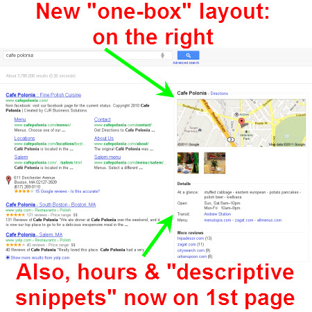
Today Google rolled tested out a new local “one-box” layout for Google Places:
What’s changed being tested? Simply that the one-box is now to the RIGHT of the organic search results area (rather than mixed in with them), and that the good-to-know basics like hours and “descriptive snippets” are right there in the one-box—visible on the first page of Google, whereas you used to have to visit the Places page to see them.
(By the way, I think we now may soon have a good name for the “descriptive/descriptor snippets”: Google now refers to them as the “At a glance” section.)
The new one-box also pops up when you wouldn’t think it would—like if you were looking up Blues greats the way I was when I first saw this change after having simply typed “Howlin’ Wolf” into Google.
The main improvement of this layout change test seems to be that it’s a space-saver. Instead of having the business, photos, etc. featured in the middle of the page with the local map off to the right. The effect is that the organic search results that used to sit below the local one-box (and possibly below the fold) have shifted up.
Also, because Google only shows the one-box when it assumes you’re searching locally for one specific business, this change makes it that much quicker for customers to get the info they want on that specific business: it’s on the first page, rather than accessible only by clicking on the Place page. Maybe Google realized that sometimes people click on a business’s website when they actually wanted to visit its Places page; this makes them have less occasion to click on the Places page in the first place.
This is minor, but this one-box also gives the mention of a business’s third-party reviews more prominence. The third-party sites that a business is reviewed on now occupy pretty visible territory, right there at the bottom of the new one-box (and above the Adwords ads).
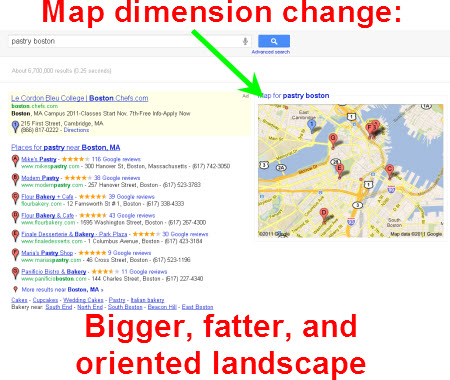
In other news, the map has changed even when you see the Google Places 7-pack. Rather than being a skinny upright rectangle, the map is now bigger and oriented landscape:
I think what Google accomplishes with this change test is now the map is just more visible and readable. It’s now big enough to see a little more detail about specifically where the businesses are located. So it increases usability a little (if you’re gonna have a map, have it be big enough to be helpful).
The other thing is that the map is wider, which means the organic search results (for local queries) have to fit into a narrower area, which means they’re all pushed down the page just a little bit.
One pattern we’re seeing here—with both of these changes tests—is that if Google perceives “local intent” of the user, it will make the local results WAY more prominent than the organic ones. In other words, if Google thinks you’re searching locally, by golly you’re going to see some local results, all right.
What do you think the significance of these changes this test is?


[…] property cronulla” (search on google.com.au). The next alert came from Phil Rozek in this article. Both James and Phil included additional screenshots of changed local results layout for more […]